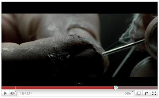
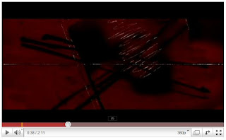
 The reason I have chosen the film 'Se7en' for my title sequence analysis is because it is of the same genre as the film that we are creating, it is a Thriller. The title sequences begin with a loud rumble of thunder which gives the whole film an eerie feel, the music used throughout the title sequences includes the sounds of a storm and is very thrilling, it gives the impression of suspense and tension. The music has a slight echo to it and is quite light to begin with, apart from the loud thunder-like sounds, although it does get heavier as it gets further into the sequences. In certain parts of the music, high-pitched noises are heard which could imitate the sound of a scream.

The title sequences only show dull colours such as greys and blacks and the only bright, primary colour in the whole sequence is red, this is extremely effective as it shocks the audience as it is unexpected. The colour black could symbolise death and horror, the colour red could also symbolise horror alongside blood and danger, this gives the audience a slight clue as to what the film may involve. The footage and images used in these title sequences are mostly close-ups and consist of books and hands, they show a lot of detail such as writing.
 Initially, we wanted to have title sequences similar to those of 'Se7en' including images flickering behind the titles etc, but we found that to do that would be very time consuming. In the end, we did take inspiration from these title sequences by choosing to have flickering white/red text on a black background but we did not use any images or camera footage for our sequences.
No comments:
Post a Comment